.png)
Knack Marketing
Marketing Agency Website Redesign

Exploring the Challenge
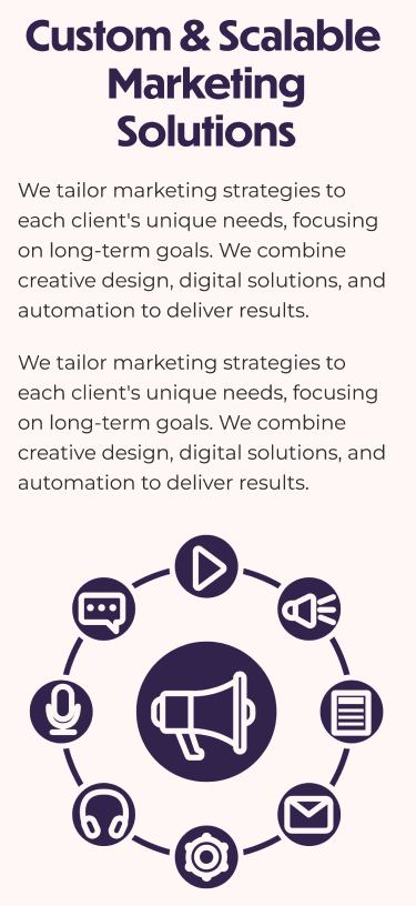
The goal of the project was to transform Knack’s online presence to better communicate its wide range of services and help potential clients explore the agency’s capabilities intuitively and efficiently. Aiming to create an approachable and professional look, this redesign aligns with Knack’s brand vision of versatility and professionalism.
Heuristics Evaluation
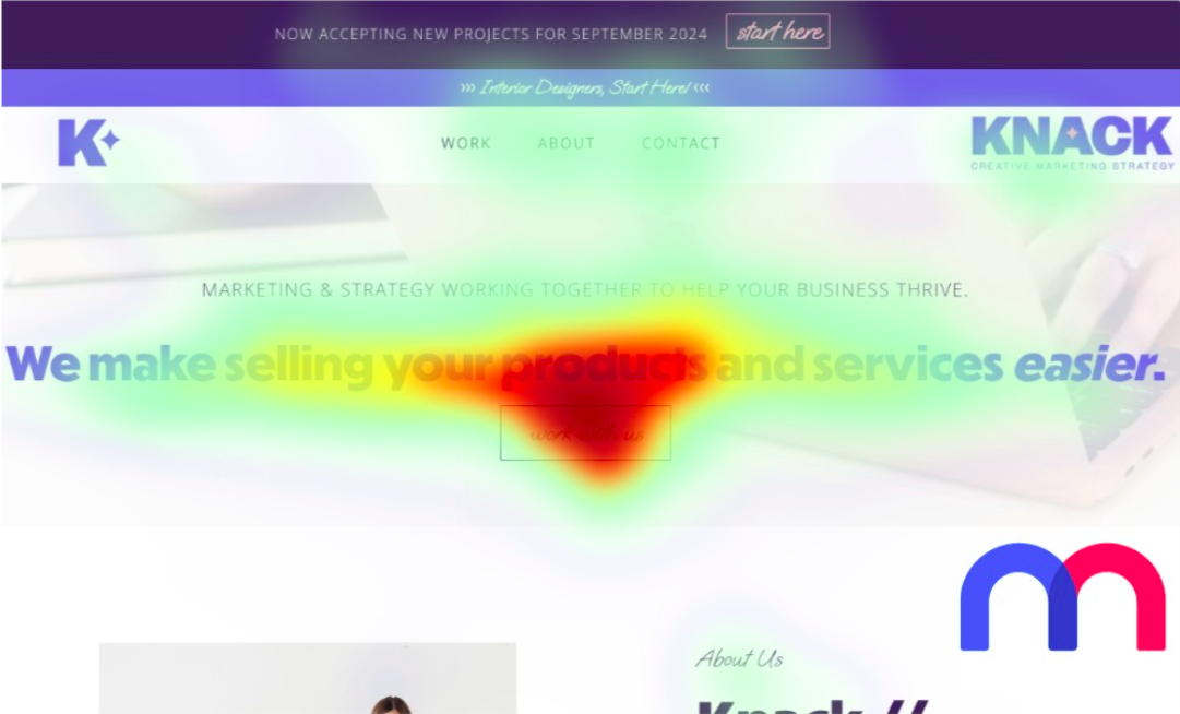
Visual Hierarchy
Visual Hierarchy
Visual Hierarchy
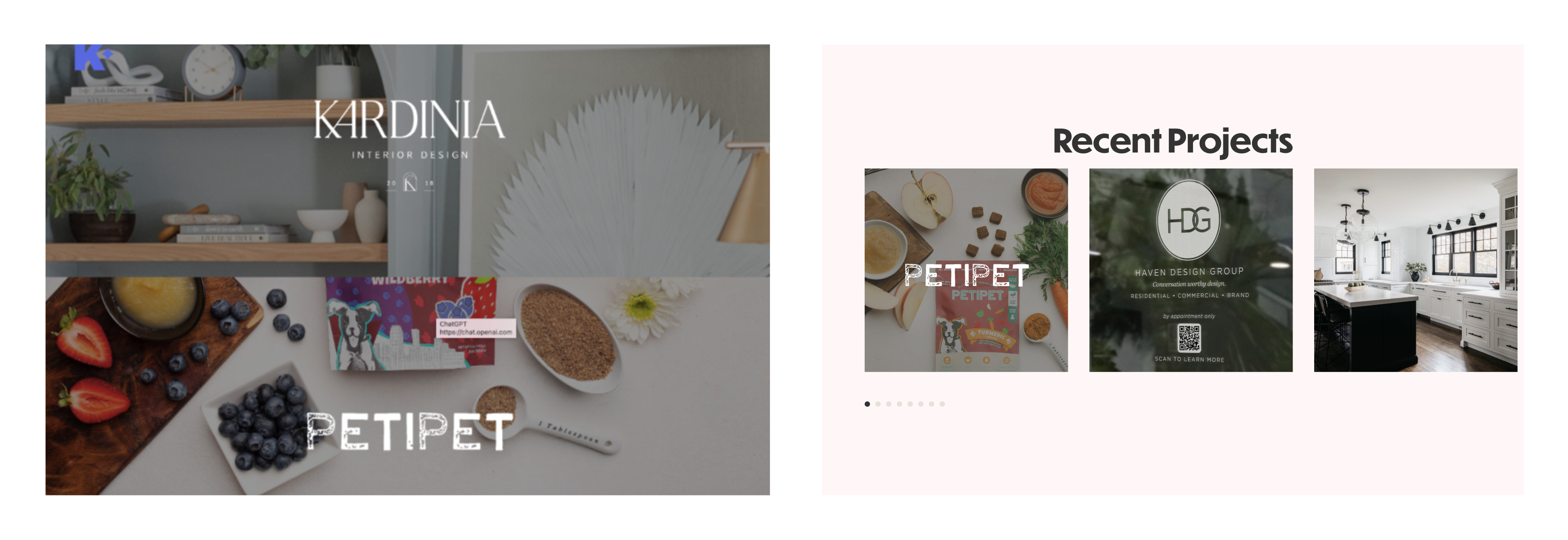
A heatmap analysis of the hero section reveals the headline is the focal point, drawing users' eyes immediately, but the lack of focus in the navigation and CTAs, such as "start here" may cause users to overlook these actions.
Typography
Typography
Typography
While the main heading is clear, the thinner and smaller fonts in the banner and nav bar may impact readability. Additionally, the use of three different font styles may distract users from the main message.

Color & Contrast
Color & Contrast
Color & Contrast
The purple and blue hues convey the company's reliability and professionalism. While not dramatically affecting contrast, the use of text on top of the images reduces the readability of the text.
.png)
Spacing & Alignment
Spacing & Alignment
Spacing & Alignment
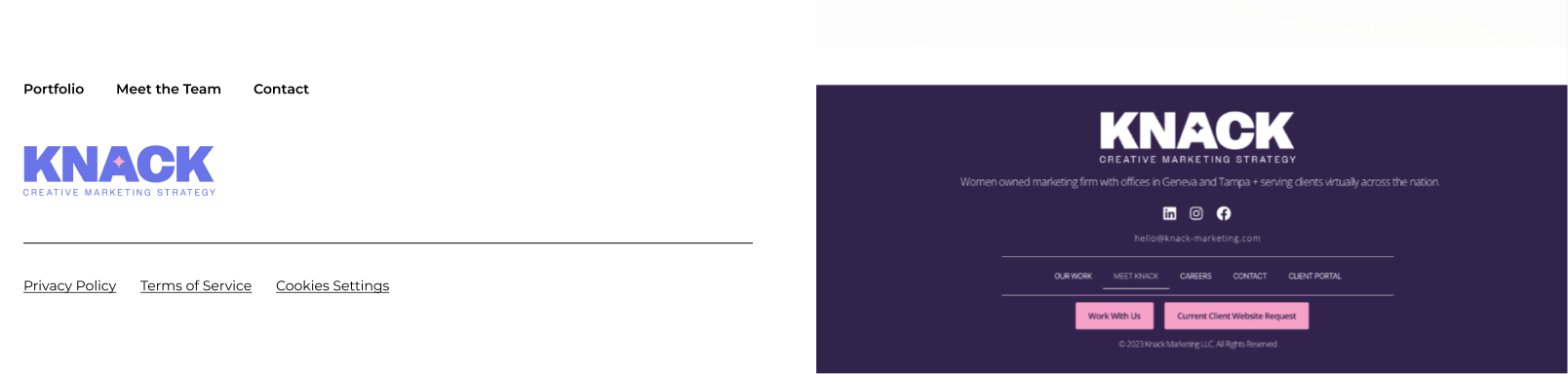
The layout maintains a clear separation between sections, but elements, such as the navigation links and the banner, feel tightly spaced, potentially causing cognitive load and limiting their visual prominence.
Ideating Solutions
Taking into account the observations made in the heuristics evaluation and the goals of the company, I began to ideate by generating wireframes using Relume AI. I then made some changes to the typography and created a more comprehensive style guide for this and for the colors. The below galleries showcase both the wireframes and typography to represent the new direction of the website
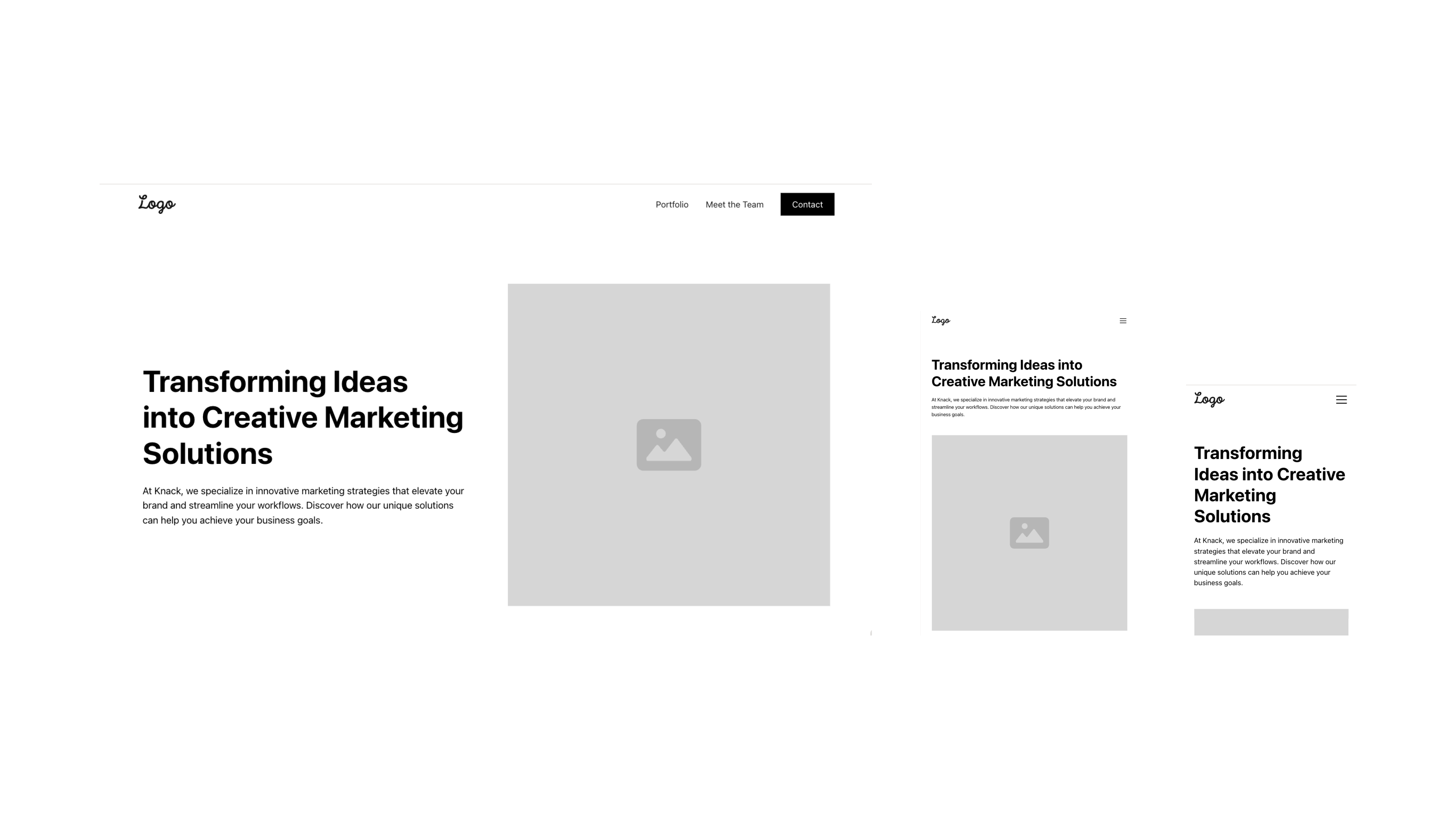
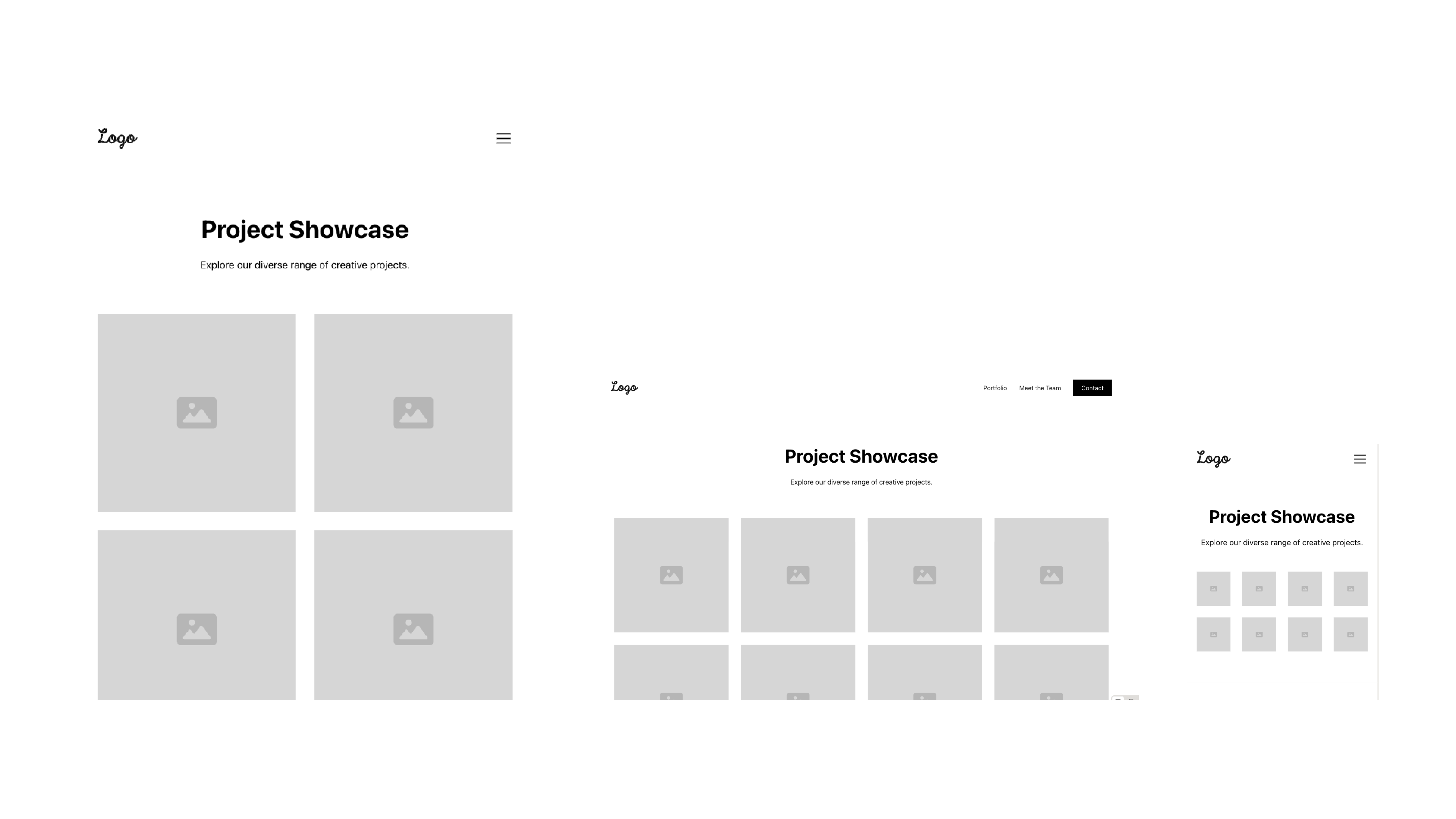
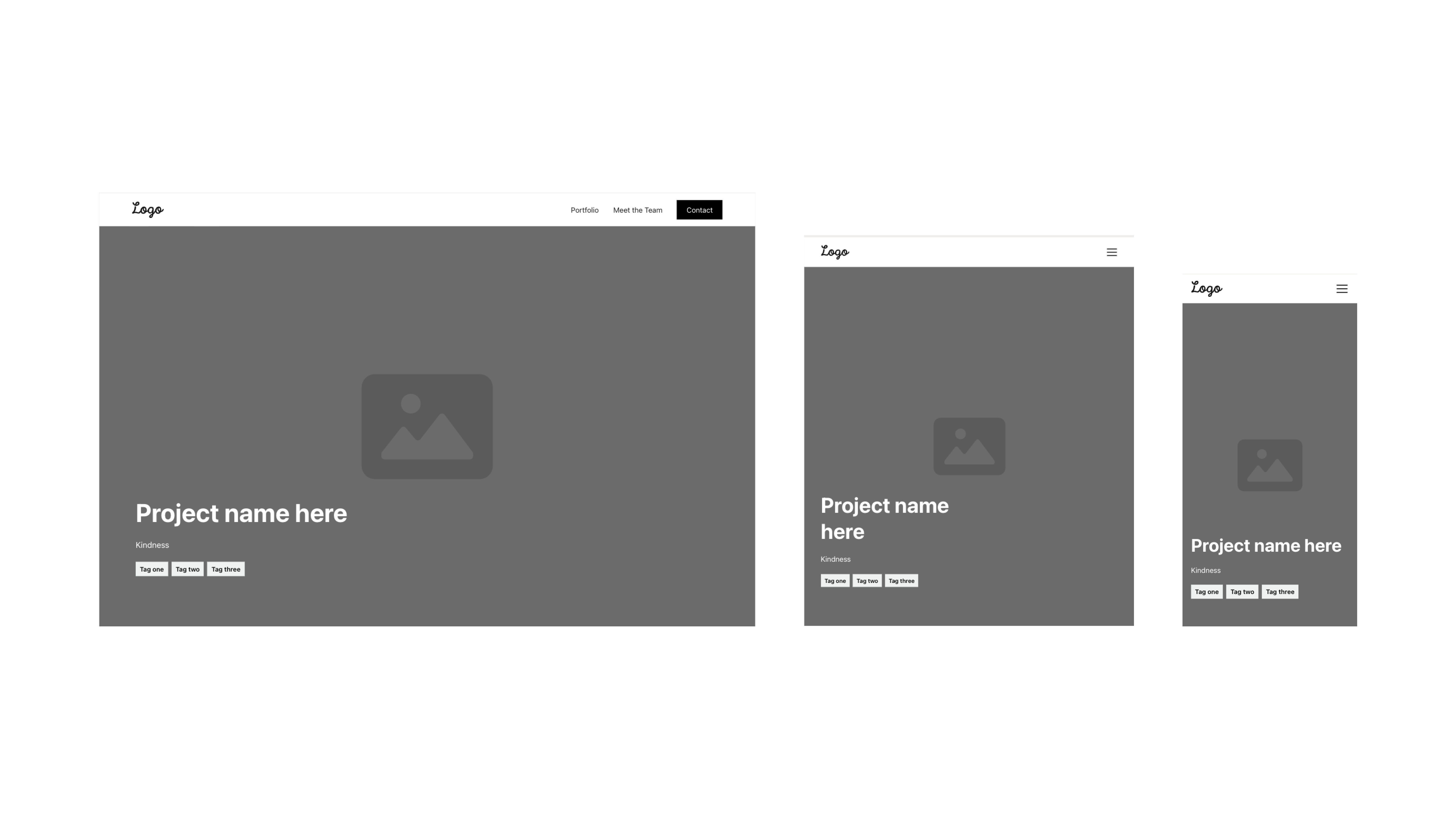
Wireframes
In the low-fidelity wireframes, I addressed issues with visual hierarchy, spacing, and alignment. The original UI was cluttered, making it hard for users to focus on key content. I streamlined the navigation bar by reducing the content, removing one of the logos, and aligning elements to the screen edge instead of centering them. I also added spacing between portfolio images to reduce cognitive load.
Home Page
Portfolio
Portfolio Project
About Us
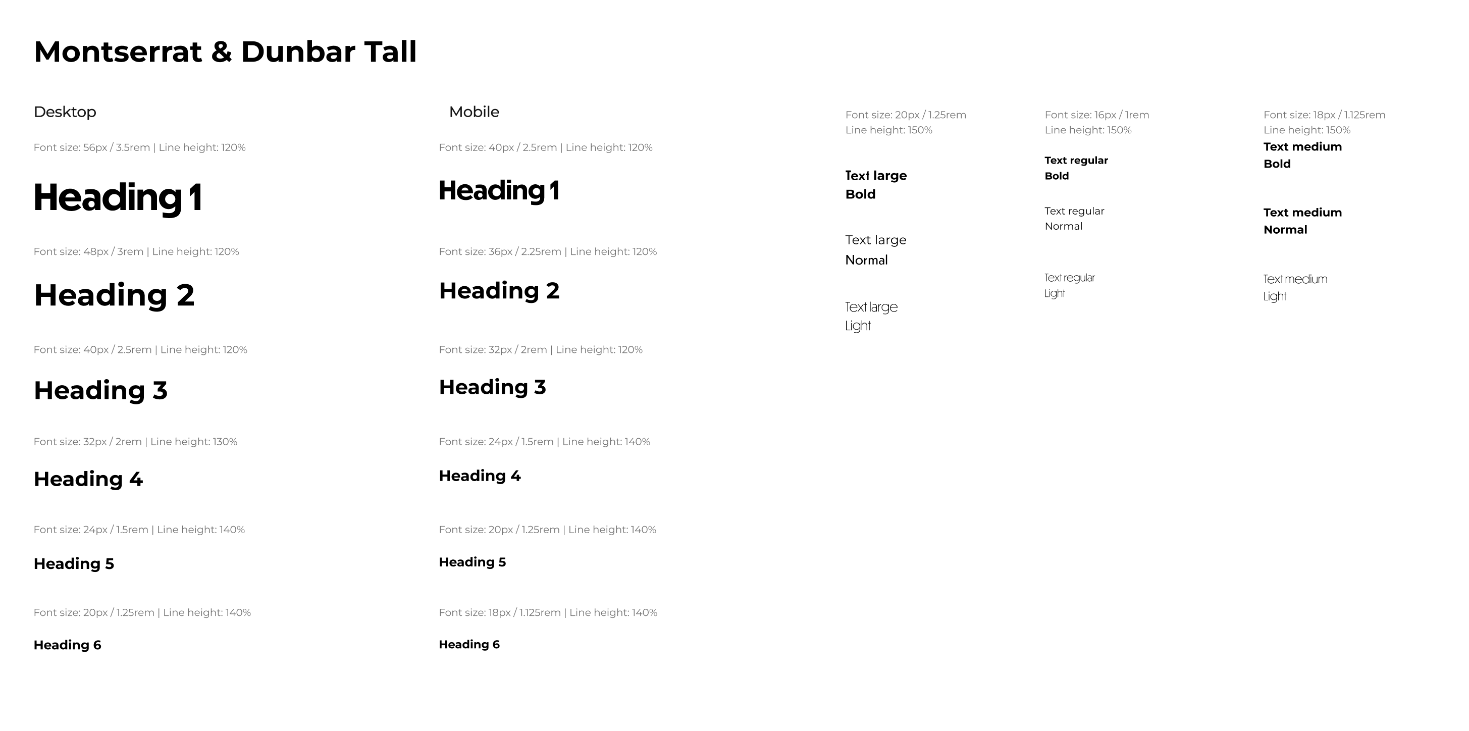
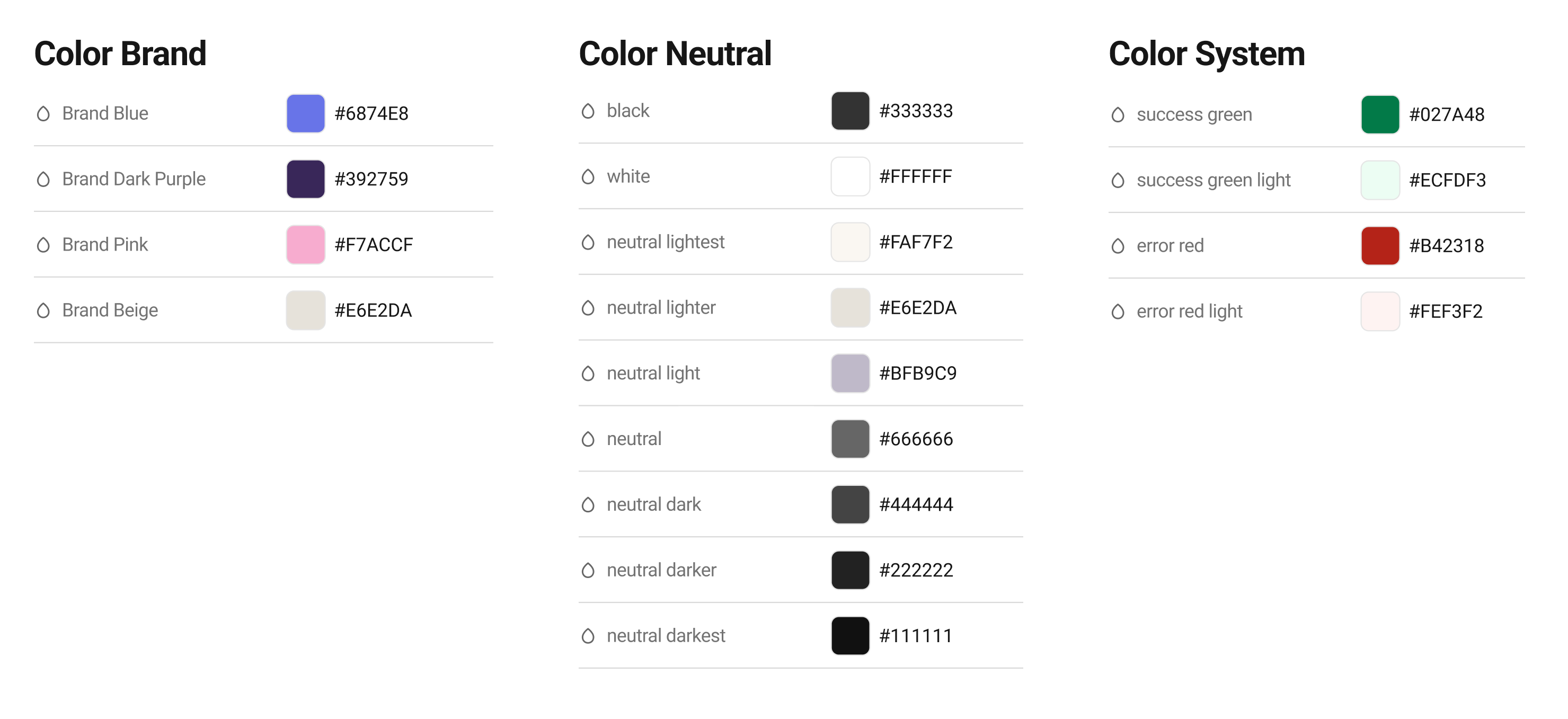
Typography & Colors
The original design used three fonts—Dunbar Tall, Open Sans, and a cursive font (Oooh Baby)—with some areas being hard to read due to thin styling. To improve readability and reduce cognitive load, I limited the fonts to two: Dunbar Tall for H1 and H2 headers to maintain brand identity, and Montserrat for body text, a more readable and widely used font. The colors stayed the same, but a more comprehensive guide was prepared for easier developer handoff.
Typography
Color
Putting it Together
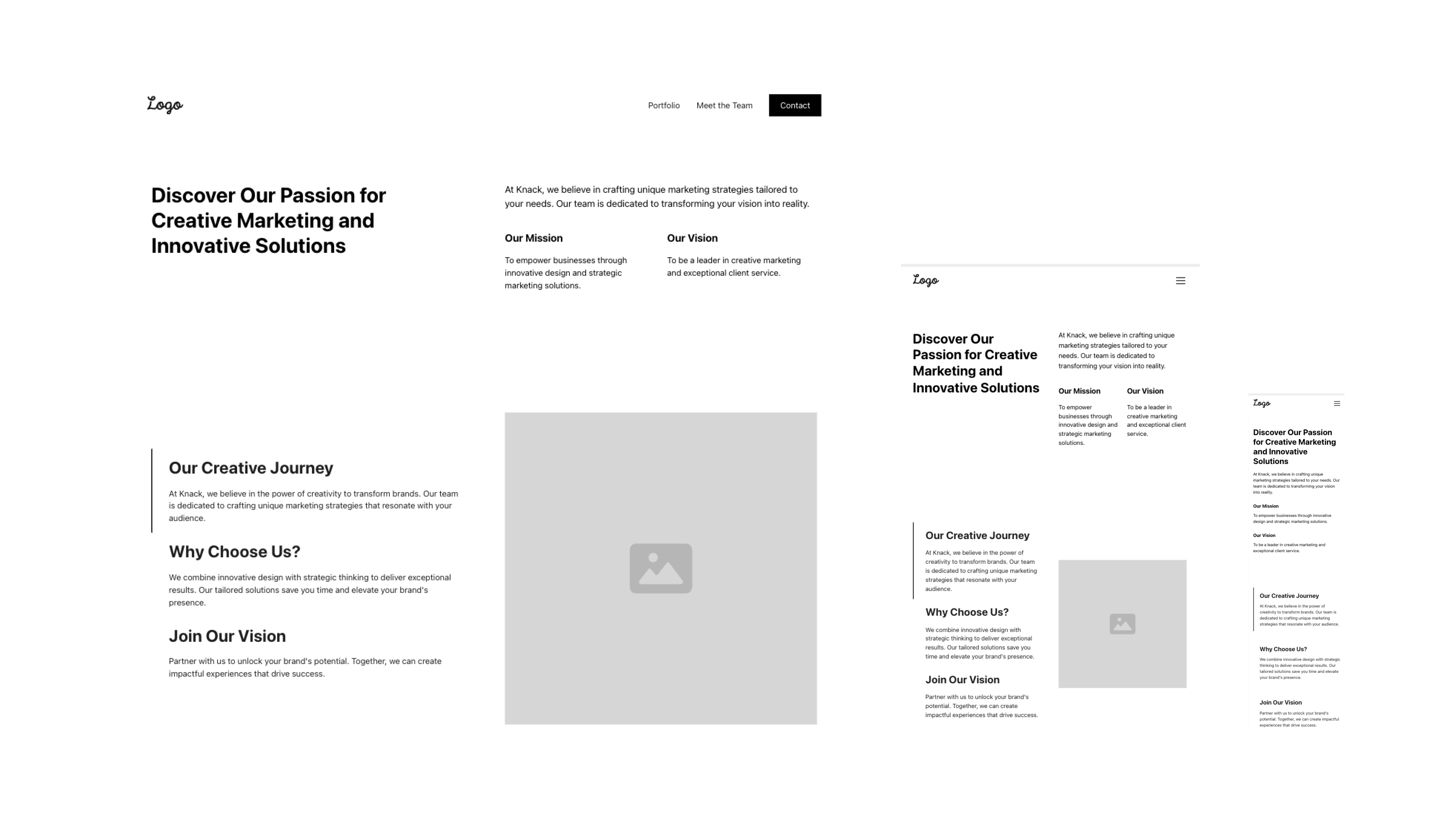
With low-fidelity wireframes and a style guide in place, I produced high fidelity wireframes. The below galleries showcase the new proposed direction (right) of the website compared to the current design (left).
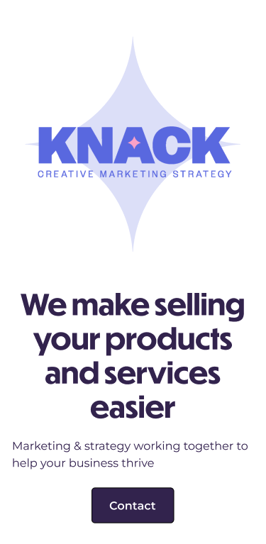
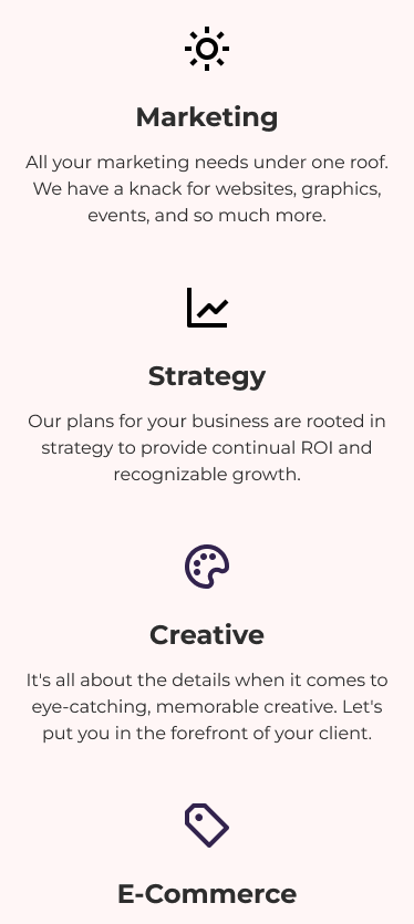
The homepage layout was simplified to bring more focus to CTA buttons. The high-contrast CTA in the navigation bar and clearer text in other CTAs make these elements more visually engaging.
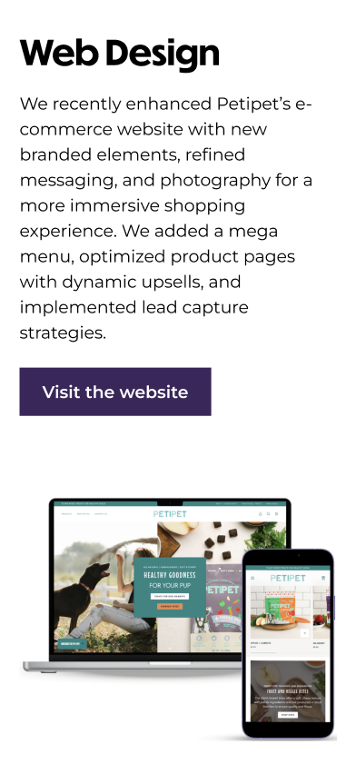
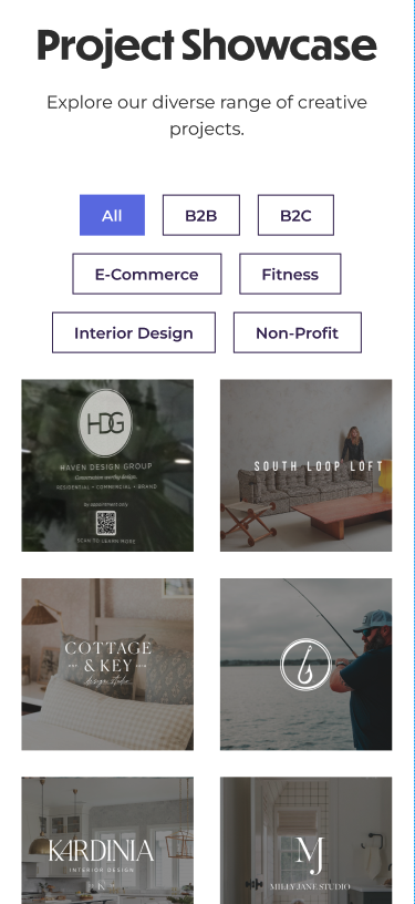
Portfolio projects now have added spacing for clarity, with an option to view more projects. This allows users to explore without needing to scroll through every item to reach the next section.
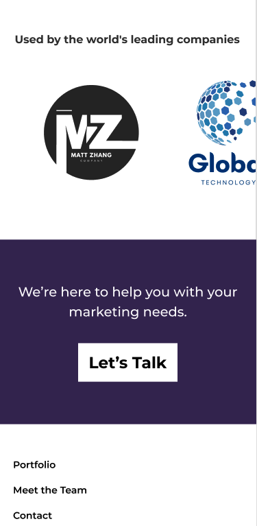
The footer design was simplified with clearer text and less content, improving readability. The amount of colors was also reduced to make it easier to navigate the footer.
The redesigned Knack website significantly improves usability and visual appeal by addressing key usability issues and aligning with the agency’s brand identity. Simplified navigation, improved typography, and better spacing reduce cognitive load, allowing users to engage with the content more easily. The updated design enhances the visual hierarchy and highlights important calls-to-action, guiding users through the site and making it easier to explore Knack’s diverse services.
Conclusion
The redesigned Knack website significantly improves usability and visual appeal by addressing key usability issues and aligning with the agency’s brand identity. Simplified navigation, improved typography, and better spacing reduce cognitive load, allowing users to engage with the content more easily. The updated design enhances the visual hierarchy and highlights important calls-to-action, guiding users through the site and making it easier to explore Knack’s diverse services.


%20(5).png)